I took the stances from the developed poses of the character to photoshop and extended the torso which worked successfully in the completed lineart that I had created using the pen tool. I used the pen tool to ensure that my lines would be clean and neat, creating contours and angles easily by manipulating the anchor point. For the 3/4 stance I used the previous face on view lineart and reference from the heads that I had drawn on the sketches to be able to create the perspective. At first I found the stance difficult through the length of the arms and the height of the crotch, in order to ensure that the proportions match, I used the guidelines to be able to pin point the height of the limbs and the overall height of the character. I also found the profile to be difficult with the face through how on the sketch I had made the jaw too wide for the neck, in order to solve this problem I shortened the jaw line by moving the face with the marquee tool slightly inwards into the rest of the face. This worked well as the length of the jaw merged well with the thickness of the neck and the rest of the body proportion.
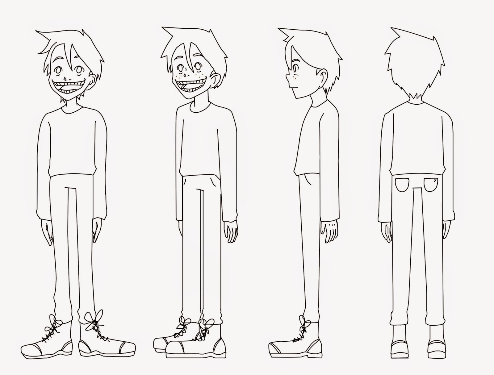 |
| 4 stances line art |
I then worked on the colour scheme for the piece, using the main face on view to experiment with colour. I found it difficult with the colour scheme that I wanted for the character as I wasn't sure on the vividness of the hues, whether I wanted the character to have bright blue hair, making it more cartoony, or just normal hair colours. I felt that either could complement the character, so in order to narrow down the colour scheme I created three sheets with different colour combinations.
The first page focused more on the hair colour and the colour of the jumper rather than the trousers and shoes. In my opinion the colour of the trousers that I had already chosen worked well with the different colours of the jumper however I still need to try a few more variations just in-case another hue would work more successfully with the composition. I didn't like the use of the light blue/light green hair on the page as it didn't work with the rest of the composition however the use of the desaturated blue jumper with the light blue hair did work well. I did immediately like the use of the dark bluey green hair, second character on the first page, as I felt that the whole colour scheme worked well. The only problem with this design was that it made the character look like a vampire with the dark tones enhanced with the cheshire grin that I had given the character. I developed this further taking some of the same hues but with different hair colours. I quite liked the ginger hair with the blue top however it still felt that it was lacking something from the design which could be the shade of the blue jumper. I thought that the crimson shade on the first design on the page could possibly work well with the ginger hair. I also liked the second character, on the second page, with the dark bluey green hair matched with a slightly dark cream jumper. I felt that the colours worked well apart from the eye colour which needed to be a different hue and more vivid.
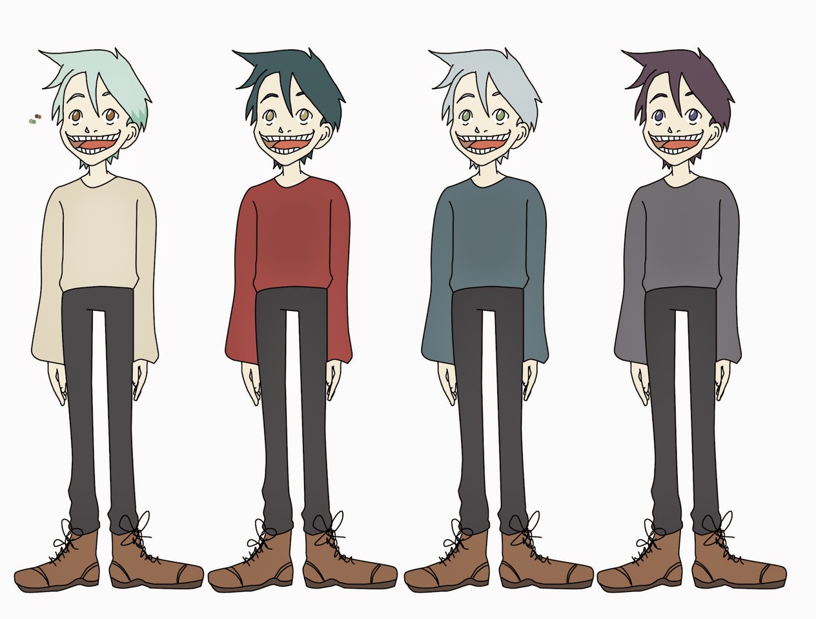 |
| Page 1 |
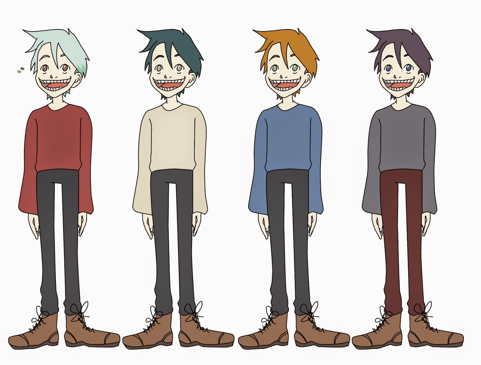 |
| Page 2 |
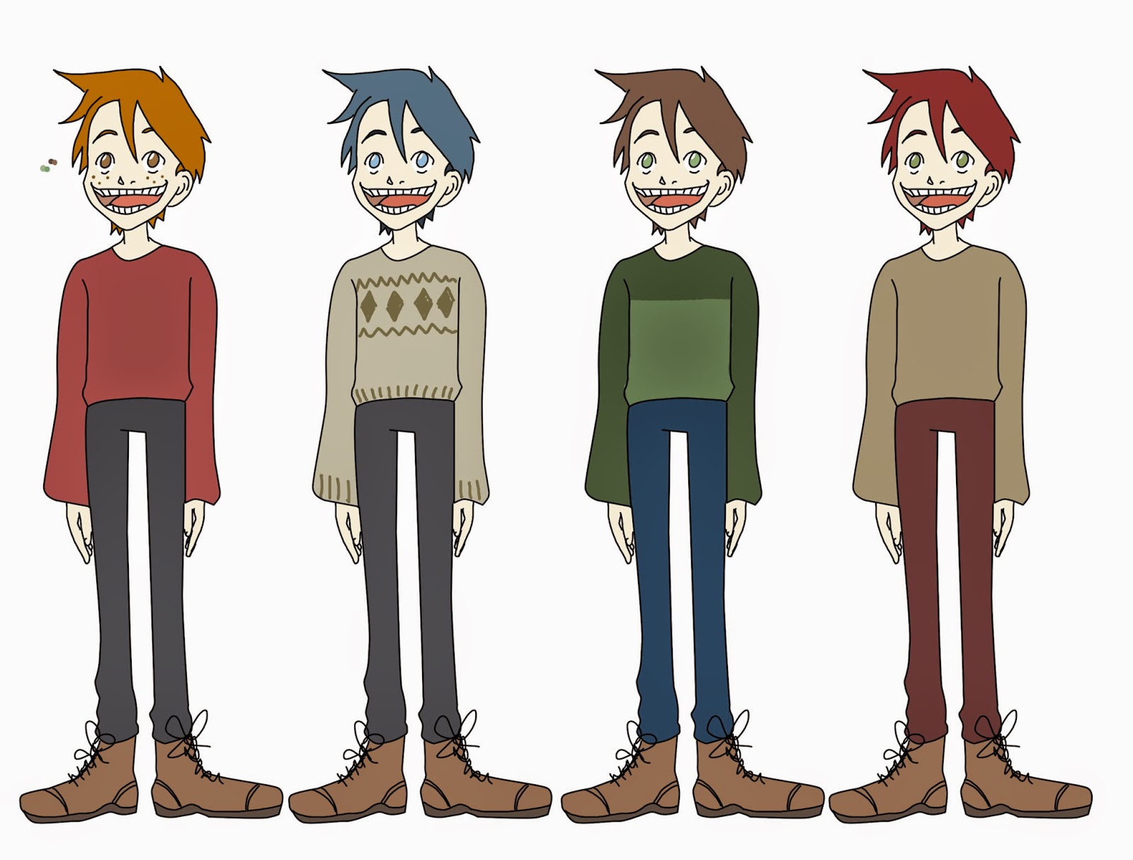 |
| Page 3 |
For the last page I added two different hair colours that were more average hair shades which worked well with the colour of the jumpers. I found that I liked the red and brown shade of hair but I also like the creamy grey jumper with the diamond pattern on the jumper. I asked for feedback from my peers for the colour scheme, the feedback was very positive and suggested to merge the red hair or the ginger hair with the second designs clothing. Even though they liked the different shade of trousers on the third design the grey was more successful with the overall composition. Using the feedback from my peers I added the different hues together on another duplicated lineart; the design was successful as the colours worked well together with the lineart. I added freckles as I quite liked the addition on the previous design with the crimson top and ginger hair, I felt that it added something to the characters personality. Lastly I wanted to add something to the top as it didn't look like a jumper with the matte colour that it currently obtained. With a basic Photoshop brush I used a darker shade of cream and made a plait like pattern, using the main arrow tool whilst holding down the alt button to duplicate the pattern to fill the jumper. In order for this pattern to fit within the jumper I changing the blending mode of the layer to multiply and used the wand tool to select the space next to the lineart before deleting the space on the knit pattern layer.
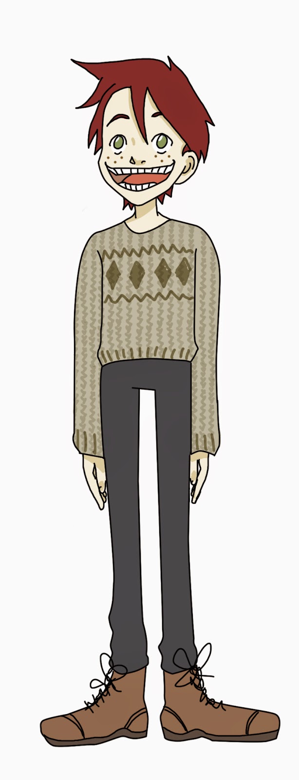 |
| Final colour |
No comments:
Post a Comment