Tuesday 29 October 2013

Eddsworld - Hammer and Nail by Edd Gould


Eddsworld is a youtube channel which posts short animations about 3 main characters in a day of their life. The main characters, Edd, Matt and Tom, all have different personalities which aids the humour of the animations. Edd Gould makes his animations through the use of the program Adobe Flash and Photoshop, this can be seen through the digital illustrations and movements of the characters.

I love the animations of Eddworld, through the amazing short stories that are matched with great humour and simple illustrative style that attracts an older audience, 12 +. A younger audience would not be suitable through some scary images, for example the zombies in 'Zombeh Nation', and the character design. ( A younger audience needs a clear objective, cute drawn young aged character and repetition of the objective with bright and pastel colours). The use of the digital program used to create the animation works well in this short as the characters movements are smooth and change to the next action point easily with out any jagged movement.


In this particular episode Edd and Tom decide to build another floor for all of Matts collection of bits and pieces, and instead of hiring builders, they try to do it themselves. As they begin to build, their neighbours mock them with their extension they built last week. Matt is given the task to buy nails, but buys everything but nails... After the roof has been built and built again, Matt is able to move his stuff into the attic, however when he goes to sleep, he gets attacked by something in the darkness...To be continued in part 2!


In part 2 of the video, Edd and Tom go up to Matts room and discover that Matt has tided his room and Matt has been possessed. After an argument between Matt and the demon, the demon retreats back into the house, not letting anyone else back in. Desperate they ask the neighbours for help but get laughed at instead, then the demon knocks down the neighbours extension, which was actually a cardboard cut out. 
The trio go head first into the house and reason with the demon after a beating from the spirit. The demon realises that he is actually haunting the wrong house and haunts the neighbours instead. 


Carn


- Summary of plot -
A dark tale, which portrays a young boy lost in the woods, cold, tired and hungry, the boy collapses and is greeted by a wolf. The wolf gives him a chance to life, by killing the wolf, wear its fur and eat it's flesh to survive, in return he must look after the wolf's young. The boy accepts and devours the wolf.
It cuts to the boy's parents looking for him, however when they come across their son, all they see is a wolf and the mother shoots the boy dead.
- End -


Carn - Jeff Le Bars from Jeff Le Bars on Vimeo.

I adore this animation, the composition of the 3-D and pose to pose animation fits beautifully within this stylised illustrations which create a tense and chilling atmosphere.
The use of making the character become silhouetted as to emphasise the blood works well as it drags the focus of the audience in and captivates them, making you feel shocked that a scared little boy has turned into this other creature that wears the skin of the young wolf cubs mother.
The music that accompanies the boy as he finally meets his parents again gives a sense of forboding as the realisation of the parents not knowing that it is their son and not the wolf, gives a cringeworthy effect as you wait for the gun to be fired. I found it especially shocking that the mother did not hesitate, grabbed the gun and shot her gun. (Then again they did think they could see a wolf.)
I feel that this animation has a moral behind it, something among the lines of, 'Whos the real monster?' or 'you are what you eat' in the sense of the boy eating the wolf.


Jeff Le Bars Sketch for short

Jeff Le Bars - Carn design

Pendulum - drawing animation with the aid of a light box

After what I thought would take me forever to complete, I created a moving pendulum by using a lightbox to help me draw the arc and plan the main key points of the animation. I first used a light blue pencil to help me to sketch out the arc of the pendulum and then roughly draw where the 25 points of the pendulum would go. (Using a blue pencil for rough sketches and drawing over the top with fineliner or pencil works well as the blue cannot be read when photocopying the work.)

I knew that the 1st, 7th, 13th, 19th and 25th points were the main key points, and I had to plan the inbetween points in such a way that it makes the pendulum slow down nearer the top of the arc and faster near the 7th and 19th mark.

Slowed down to see each individual frame

Normal speed


My attempt at the pendulum worked well through how the swing of the pendulum runs in an arc and gains speed as it swings back to point 7 and 19.
I found this task difficult but interesting at the same time, as I've essentially learnt part of the basics and want to experiment more with different movements.

Monday 28 October 2013

Louise Bagnell


Louise Bagnell's graduate short, which she made in 2007, portrays a timid girl that doesn't have enough confidence to make friends and decides to go exploring, where she can be herself in her own world. She stumbles across a 'jack in a box' and angers a robot bee which flies out of the box. As she runs away from the bee, she accidentally bumps into another character, and they become friends, exploring together. 
This animated short would be suitable for a young audience through the use of the main characters design, the colouring used, the music and the plot of the story.
In my opinion, I believe that Bagnell uses traditional pose to pose animation through the sketchy design of the characters and the background illustrations. 


Marmalade by Louise Bagnell


 Blogspot     -    Tumblr     

Food - Jan Svankmajer 1992


Jan Svankmajers work is something to be inspired by through the composition of the animation, the plot and how smoothly the pixilation runs. I feel that the pixilation works well with these stories, as it would not be as funny and flow as well if the animation was made traditionally with cel animation, the use of people with in the animation makes the humour and the plot work.

Svankmajers work inspired me through how he used perspective and angles of his frames to his advantage to get the point of the action across to the audience.
The audience of this video would only be suitable for an older audience through the plot used and the more complicated storyline. For a younger audience, a simple story with bright colours is needed to attract the attention of the target market.


- Summary of plot -
This video shows 3 pixilation, animations that suit the theme of Breakfast, Lunch and Tea.

The first part of the video - Breakfast -
Shows a man walk into a room and sit down with another man, he sees that in order to get food, he has to follow a few instructions which is around the sleeping mans neck. The use of the humour merged with the animation well, especially with the model clay face as the man pulls out the other mans tongue to pay for the meal. I love how the plot forever continues through how the next person who comes to eats a meal becomes the next 'serving machine'.

The second part of the video - Lunch -
Two men sit down for a meal at a restaurant and try to get the attention of the waiter. One of the men decides that he can't wait any longer for food, and begins to eat the flowers on the table, in which the other man decides to follow in suit. In the end they begin to eat their clothes, the cutlery and the table, till the man decides to eat the other man.

The third part of the video - Tea -
It begins by showing a man adding different condiments to his food which we cant see yet however from the sounds of the condiments, it makes the audience feel as if the food is vile and disgusting.
It pans out to show him eating an arm, which I believe could have been his own arm, as his left arm is made of wood. It then shows other people eating other limbs, such as legs, boobs etc.
It had a funny approach to self cannibalism but also a suggestion of 'people will eat/try anything', I feel that this also relates to peoples self greed.

- End -


Alex Grigg - Phantom Limb - Late Night Work Club


Late Night Work Club presents GHOST STORIES from Late Night Work Club on Vimeo.

Griggs animation, Phantom Limb, starts at 18:40.

Griggs animation short portrays a woman who has lost her arm and her partner who feels guilty for the loss of her arm. In this short we follow the man as he tries to cope with his guilt, which ends up engulfing him and causing him to drink and see her arm wherever he goes.
He comes back late one evening and realises that he can be there for her and act as her other arm.
The music used in the animation adds to the feeling of loss and dread that both of the characters are coping with at the same time. Matched with these aspects, the form of the digital based animation absorbs a traditional feel to it through the line and solid fill of the illustrations.

The animation runs slowly and is visually stunning through the art portrayal and the plot of the short.
In my opinion, I believe that Grigg has used digital and pose to pose animation through the movement of the characters and colour used in the short. The pose to pose animation would have been used for the movement of the characters and the transport used, the digital side being the application of colour and putting every frame together.


(Griggs part is shown at the start for 10 seconds. Animators were given a set of colours to work with and animate imagery of their favourite show on Cartoon Network.)

Grigg also animated a 10 second short in a collaboration with other animators for the company Cartoon Network. The task was to create a 10 second short of your favourite cartoon on CN and only use a certain set of colours. 

A detailed close up of Griggs part of the video collaboration

In my opinion, Griggs has created this short through the use of a program such as flash and merged that with a part traditional animation of pose to pose. These both work well together as flow smoothly into another and create a different dimension or plane in which the character travels through for a sword.


Alex Grigg   -    Tumblr    -   Twitter

Photography induction


During the Photography sessions, we experimented with lighting within the studio and how we can add light to an image via reflector or introducing a softer/direct light.

Two shadows - needed to move light to create only one primary shadow

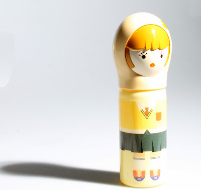
over exposed - too much light in image

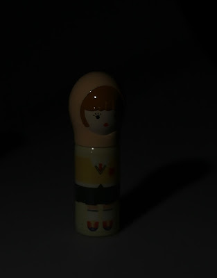
under exposed - too little light
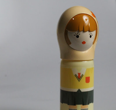
Almost perfect lighting - rich colour with a good shadow


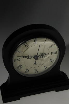
This image is still too dark, however this lack of lighting would work with a tense atmosphere

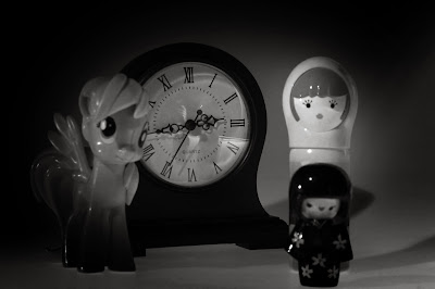
Still slightly dark, however the reflection with in the clock face works well.

I desaturated the image and vignette via photoshop to bring attention to the clock face and its reflection.


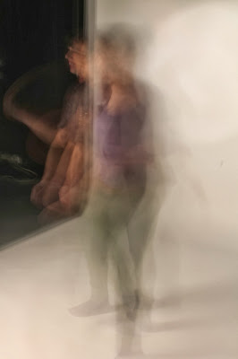
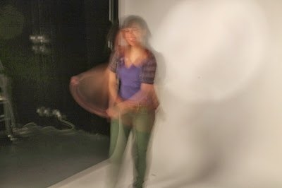
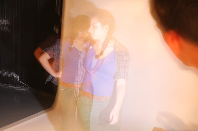
We then looked into continuous shooting, which we merged with a slow shutter speed, that resulted with a multi exposure image, showing kinetic movement.


Multi Exposure - slow shutter speed


Multi Exposure - slow shutter speed


Using a primary strong source of light that flashes as soon as the shutter takes an image

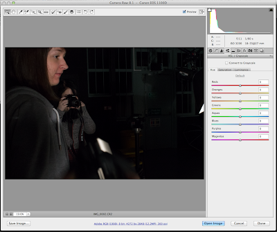
I also learnt how to change Raw files ( as I was using a Canon SLR the files are called CR2) to Tiff files, which was a surprisingly easy process. In order to export Raw files to Tiff, open the file, set the levels to the correct format, and open this in Photoshop.


Double click on the file and set the levels and click open image

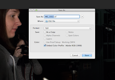
This opens the image in photoshop in which you can then save as the image.

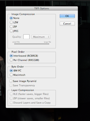
As I am saving a Tiff image I needed to ensure that there was no image compression to avoid loss of pixels/data. 

Lil' Red by Cale Atkinson


Lil' Red from cale atkinson on Vimeo.


Cale Atkinson creates his work through the use of digital media, in my opinion I would guess that Atkinson uses both pose to pose animation and flash/other digital animating aid, e.g Adobe Premiere. 
In this short, I can instantly tell that the animation is digitally produced through the use of rough and variation of line matched with the bright and colourful scenery of the video.

The music matches well with the animation through the use of the xylophone and the upbeat melody of the song. It seems to help portray the distance that the girl has travelled and the speed of the wolf.

The plot of the video runs with an edited and interpreted version of the Brothers Grimm, Little Red Riding Hood, which can be seen through the use of the wolf and girl wearing a red hood. 

Target audience would be acceptable for a young audience from age 10 but not suitable for any younger audiences through the lack of understanding with the plot and the imagery of the wolf.
The wolf is portrayed in a rough sketchy line quality with red backgrounds and speed lines, which adds to the dark atmosphere of the villain in the animation.
When watching the video, you automatically think that the wolf will catch up with Lil' Red and 'gobble' her up, however she beats him up instead and makes the wolf her 'slave', giving a happy ending to the story.


Take a look at his website and twitter....

Pixilation Video - Prey/Predator


Here is my Pixilation video which I created from my previous storyboard and initial ideas. To create this video I used the Photography studio and equipment to easily shoot the amount of photographs I needed for my pixilation animation.

To create a Pixilation animation, I needed to take two photographs of the movement per second of the video.  For example, in my video there is a walk cycle in which I had to take two images per movement of the walk, (I would say I took possibly 30 photographs for the first few seconds of the video, for the walk).

I wanted a plain white background for my video as to show the distance and perspective of the plot easier. The animation portrayed this well, however, I could not get both the hand and the person both in focus, due to the distance of both objects within the image, so the focus changed between characters quite frequently in the animation.


- In order to create this video I used wireless remote shutter and connected the camera to the computer as to see the images better with focus and portrayal, (as I used my right hand within the video and my left to take photography with the shutter remote). -


Monday 21 October 2013

Pixilation Storyboards


I edited the story boards from the previous post sketches and initial ideas of the Predator/Prey theme, by changing the plot and characters slightly.
I decided to only have two characters, as to not make the story seem complicated, and only show the giants hand within the video. I could still use perspective with in my video by having one person stand near the camera, to give the suggestion that the hand is bigger than the character in the background.

Part 1 - introduction of characters and action

Part 2 - continued action and ending

This edited idea has more of a story to it compared to the previous initial idea as the ending of this storyboard shows the character beating up the hand and walking off the frame, happy with a spring in her step. I feel this could also work better as it shows the struggle between the predator and prey, rather than the initial plan of just having a giant eat a human, which is continued by bigger giants eating the smaller ones.

I didn't include lots of different variations of camera angles as for this video it would be easier to include the distance of the frame, a long shot, as to differentiate between the hand and the character easily to the audience.

Sunday 20 October 2013

Pixilation - ideas and storyboarding


I was given a study task to create a pixilation video that contained one of three ideas,
- Host/Parasite
- Predator/Prey
- Parent/Child


I first quickly generating ideas for my pixilation video by creating a mind map and then sketching thumbnail storyboard from this.


In my brainstorm, I jotted down a main idea and developed on top of this. I use my mind map as a basic points for the ideas to develop from, I prefer to develop the idea through quickly sketching the idea out and seeing how well it would flow. If it didn't flow well, then I would go back to the mind map and develop the idea more and then sketch the idea again.


Host - ghost possession

My Host/Parasite idea, held two characters, a human and a ghost. The ghost would possess the human character and do things which the ghost had missed, for example, eating, shopping, sleeping and having a normal day routine. The ghost then adapts to modern technology, sees something on the Internet that scares the ghost, and flees the body. possession


Child - Teddy bear comes life
My Parent/Child idea, held three characters, the child, mother and teddy bear which comes to life.
The main plot involves the child being sent to bed for not eating her vegetables and upon being upset, her teddy bear comes to life and plays with her.


Predator - Giant eats human
My Predator/Prey idea, held three characters, a human, a giant and another giant. The main story sees a character walking down the street when suddenly, a hand appears from the sky, picks the character up and eats them. Next the giant is walking down the street and is then eaten by a bigger giant... and the cycle continues...


I quite liked the Predator/Prey idea through how I could experiment the perspective of the shot with in the finalised video.


Pixilation - Luminaris

Whilst researching into Pixilation, I found an animation called "Luminaris" by Juan Pablo Zaramella.
I love the composition of the piece, through both the era that it is set and the rich colours which intwine with the plot of the animation.


 - Summary of Video -
The video follows a mans routine of going to work, making lightbulbs, and everyday he takes a few of the glass materials and adds it to a jar at home, which is nearly full. We see that the men make lightbulbs by chewing glass and the women give light to the bulbs by blinking at the object. We then see the man fired from his job for being caught stealing the bulbs and his plan for these bulbs are ruined. We then find out that his partner at work wants to help him and they create this hot air balloon light bulb which takes them away into the night.
- End -

 In my opinion, the video holds a stylised 1950's and steampunk appeal to the animation, through the cg set design and the modelling used. The 1950's feel emits from the character design and the over exaggerated expressions. The movement of the characters was quite fluid and partly jagged however it worked well with the surroundings and the overall animation. (I felt the happy atmosphere and the jagged movement of the animation went hand in hand and gave it an aged edge to it)  It gave me inspiration through the lack of dialog and the dependence of the body language via expressions and movement.

Sunday 13 October 2013

Storyboard close ups

Here are some of the storyboard panels in close up, so you can see the detail better. To create my storyboard images, I first sketched with a B pencil, scanned into photoshop, which I then outlined with the pen tool and coloured in.


Photoshop coloured Storyboard - animation edit


During the process of creating my storyboard, I considered the angles, direction and action with in the frame which would lead and flow into the next panel. I found this hard to keep different in the sense of the motion of each panel, I didnt want the panels to appear the same in both angle and zooming in sequence. As my storyboard considers the key points of the animation with in 12 panels, I had to imagine what action and movements would be inbetween the panel and lead nicely to the next. I did find this difficult to imagine with in the first storyboard but having the panels coloured actually helped me to visualise the sequence of movement between the characters better.
storyboard 1 - Introduction of characters and objective


storyboard 2 - Action


storyboard 3 - Jills end


Saturday 12 October 2013

"Stay In My Memory" music animation by Katy Davis


Katy Davis creates her animation through merging a normal 2-D animation with amazing backgrounds of a pop up book. The animation itself ran smoothly and jagged in places, however the jaggedness of the movement of the book and the backgrounds made the video tactile and visually pleasing, as the rich colour scheme contrasted well with the main character animation.


With in the short animation, I particularly liked the outdoor background which contained a sepia and desaturated colour scheme with a few hints of vivid colour from the autumn tinted leaves of the trees. I felt this short scene worked well as it contained a vignette within the background and created a small form of a spot light which highlighted the character through the difference of animation used.


The animation was originally made for a music band 'Bim' and flows well with the lyrics through the character's journey of trying to find her loved one and cling onto the memory of him.
Katy Davis has also created animations for companies such as Samsung and E4, her work can be found on her website http://www.gobblynne.com/


Alice Madness Returns: cut scene animation


"Alice in Wonderland Madness Returns", a world depicted in a chaotic and violently twisted adapted tale of Lewis Carroll's Alice and Wonderland made into a game format for the PS3 and Xbox.
I loved this game through both the plot and the character design within the different worlds of Wonderland, however the cutscenes indicating the change from reality into wonderland are awe inspiring in a sense of composition and design.

The cut scenes in this game are animated with a paper cut out appeal with a beautiful dip pen, traditional illustrative style that fits the aged storyline as well as the victorian era in which it is set in.


The appeal of the animated shorts is not only the illustrative style but also the textures which are used with in the clothes and background that makes the media feel tactile. I also like this animation through how the characters movements are slightly jagged and not a smooth flow like a normal 2-D animated character, but follows the paper cut out appeal, as if the pivot points of the limbs are joined with drawing pins.


Even though the game is slightly gorey in parts, I would recommend it for the concept art of both the backgrounds and the characters with in the Wonderland world as it obtains a victorian style with an insane fantasy twist.


Friday 11 October 2013

Photoshop induction session - Animating through frame by frame

During the Photoshop induction, I learnt to use Photoshop to animate, using layers as frames. 
The whole process was actually easy after you learnt the basics and got into the routine of the way the animation would be step by step. 
I had already looked into the photoshop process of animation and learnt more on top of what I knew during the induction. For example I learnt the stages of bouncing a ball and the right moment to squash the ball as it collides with the ground. The ball needed less frames near the beginning of the animation, and more frames bunches together as it nears the ground, as to give the effect of the ball slowing down. 

I then looked into creating other animations, such as eating an apple, a pendulum in a grandfather clock with a mouse running alongside it, a character blinking and the start of a skipping/walk cycle.


So far the skipping cycle is far too fast and needs more frames with in the animation to make it slower. I also need to ensure that the person jumps up and land back down to walk off the frame, rather than jumping and staying at that height.

Wednesday 9 October 2013

Storytelling - Nursery rhymes


 After choosing a nursery rhyme to base my storyboards on, I began to sketch rough finelined post-it note drawings as a guideline for the final storyboard. I based my storyboard on the rhyme of Jack and Jill, in which I thought I would be able to fit the key action points, within 12 panels.

1-6
I began the image sequence, with an extreme long shot as to show the audience the surroundings before going into a long shot, revealing the main characters of the plot. Panel 3 shows the characters walking up the hill before the introduction of the snake, which Jack steps on and is attacked by the snake, making him fall down. Jack lets go of the bucket before he falls down, leaving the bucket to hit Jill in the face and come tumbling after Jack.

7-12

In the more edited version of the storyboard, I need to add more detailed angles and shots to make the animation more interesting, remembering to keep the rule of thirds in mind.


Before I started adding more detail to the storyboard, I created character design sheets for Jack and Jill, as to have a reference throughout the process. 

Character Design: Jack


I thought about designing Jack in an aged style, making the chin more formed with more detail to shading and hair, however I felt that this did not work well due to the nursery rhyme originally being aimed at a young audience. Using a more simplistic and child like design to Jack worked well with the storyline however the storyline itself would be aimed at an older audience due to the slight violence of the plot; Jill getting knocked out via bucket. Keeping a simplistic style in mind, I alternated between two illustrative designs. One being simple with the facial features and not adding a nose to make the drawing seem younger and cuter, the other being more detailed but with a rounded face and characteristics to the facial features which seemed to outshine the previous style, especially when I added colour to the lineart with letraset Pro Marker pens.


Character Design: Jill

I then began to design Jill, similar to the character designs of Jack. After drawing out the illustrations, I felt that the last design had a young audience appeal and gained more characteristics than the less detailed sketches with lack of facial features. Not only did the addition of colour help to make this decision but the last design linked well with the Jack character design, and could be seen as twins/siblings.


Flip book research


I researched more into the flip book animations as I was curious as to see what other artists and animators had created using this process. I found two examples of flip book animations, one which used photography and the other hand drawn with the use of a light box to aid drawing the same character again and again. 


Photography Flip book

- Summary of video -

Music video for the band winter gloves - let me drive, merges well with the lyrics and music of the band. was created by taking photography of the band and then printed out into a flip book format.


I thought that this flip book was quite clever through how the use of photography was of the band members alongside of the music that they had created for this music video. (The photographs have been coloured in as well which gives a illustrative style to the design).


Traditional drawn flip book

- Summary of video -

A flipbook animation by a youtuber etoilec1, in which depicts two anime characters from the programs Naruto and One Piece, fighting. This animation tears through 4 or 5 flipbooks, including colour with in the animation, which is dedication and painstakingly time consuming, not to mention the detail of the illustrations.


I felt that this animation worked well through how the character design ran smoothly and the illustrations fitted with the transition of the movement.

Storytelling - Nursery Rhymes


For the Storytelling study task, I had to choose a nursery rhyme in which I would recreate into my own version, formatted into a storyboard.

I immediately reminded of the Brothers Grimm Fairy tales in which, have influenced stories and rhymes for generations, with the cruel twist at the end of the fable and always leaving the reader with a moral. For example in the story, Little Red Riding Hood, it is interpreted to leave the audience with the moral of "don't stop to talk to strangers" or even "never wonder from the path", and some interpretations believe that the Grimm's story of Red Riding Hood is feminist through how the beauty of Red is emphasised and needs to be rescued from the beasts belly.


I then looked into popular nursery rhymes such as Humpty Dumpty, Hey Diddle Diddle, and Jack and Jill.  The rhyme was simple through the structure of the verse and the illustrations were drawn to suit a young audience through the use of colour, matched with less detailed lineart.
I felt that the best nursery rhyme was Jack and Jill through how I could visualise the journey to fetch the water from the well, in which I would be able to easily add my own twist to it.


Humpty Dumpty


Hey Diddle Diddle

Jack and Jill


I started to sketch early ideas of what Jack and Jill could look like with in the storyboards. I wanted to create Jack and Jill with similar facial traits as to make them siblings. I wanted Jack and Jill to be portrayed as siblings as I felt that it would be more connected to the nursery rhyme, matched with a child appearance to link with the young audience that the rhyme is aimed at.

Initial design of Jack

Inital design of Jill