Thursday 26 December 2013

Message


Message from Animade on Vimeo.

I found this advert on Vimeo and I immediately liked the simplicity of the animation.

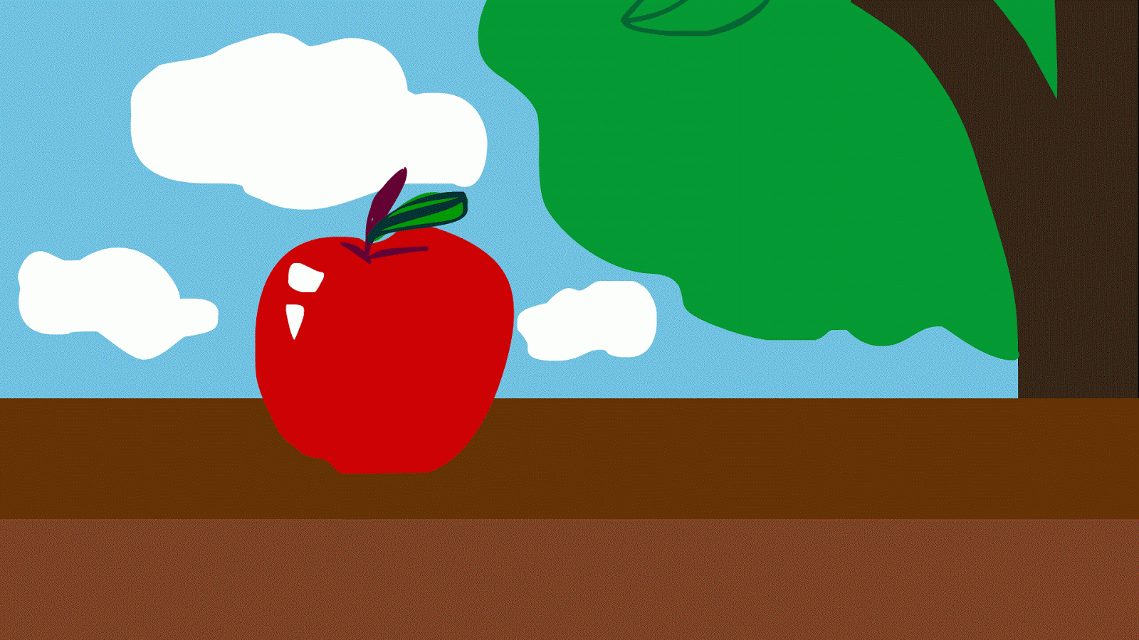
For this new project, I wanted to make an animation that was simple in background, in which I could elaborate with small parts of detail, that wouldn't take away the main attention of the animation. With the last project, I made an animation that functioned well however there was too much going on in the background which made the focus differ between different aspects of the animation, the main focus was slowly lost through the duration. 

The advert used only three main hues, red, cyan and black, which held a print grain quality to the illustration of the character. The animation is simple yet effective with the small movements of the head and limbs which flow well with the incorporation of the arcs and secondary action of the movements. The continuation of the rotation of the three sections of the square works well with the animation through the clean transition to the next scene. 
The audio uses a upbeat guitar tune which could be used to imitate a walking cycle with the 4/4 beat, and works with the animation through the rotation of the square sections. 

Avatar : Legend of Korra

I recently watched Avatar: The Legend of Korra which contained a flashback to the very first Avatar, a being that can control the main four elements, fire, wind, water and earth.

The flashback was portrayed in a gorgeous traditional Japanese inspired art, which can be seen in the quality of line, colour and structure of the object drawn.  It made me think about the variation of line I could achieve by using different brushes and mixed media to portray the object I have drawn in a certain atmosphere or age. I felt I could achieve the same quality of the traditional style by using ink and a soft wash of watercolour to gain that aged feel to the images.


Merging this style with an american cartoon/anime character design worked surprisingly well and helped the plot with the portrayal of the era it was situated in which was aesthetically pleasing to the eye, from the movement of the clouds to the movement of water and fire. 

Disney - Treasure Planet Backgrounds

Treasure Planet has always been one of my favourite films which has inspired me through its beautiful illustrative backgrounds and character designs. The backgrounds hold a painted feel to it, which can be seen through the soft blur on the reflections and shading.

The backgrounds needed to contain a futuristic yet aged twist to link with the pirate theme, they achieved this by using a tudor structure with the houses, the wooden structure that decorates the exterior walls, and the use of cobbled streets. The main town/city in which they situate in, shows the streets of houses ascending into a point, as if built on a mountain. On top of which the place is floating in the sky, which matches well with the flying pirate ships that wait at the docks.


Looking back at the art of Treasure Planet gives me inspiration for drawing different locations in which I could develop further into something that holds a futuristic twist to it or age and decay it to make it look aged. 

Tuesday 10 December 2013

No Turning Back


No Turning Back - Sarah Blasko from Hornet Inc on Vimeo.


Another aesthetically stunning animation that I believe used a mixture of pose to pose and straight ahead processes that holds a tactile illustrative style. I love the use of the secondary actions with in the animation that can be seen as after the anticipation of the movement of the wolf as it runs, for example the hat on the characters head. It gives an appeal that makes it more lovable and aesthetically pleasing. The secondary action is subtle and does not take the attention away from the main focus of the short.

The music starts with a strong beat of a drum, before the vocals start, the vocals are softer compared to the harsh drum. The music reminds me of someone marching, through the use of the drum, and the piano reminds me of an old style cartoon which uses the lower keys to emphasise the villains creep and footsteps as they near the main character. The music fits the video through the use of a surreal and fantasy based format of the animation, and the main beat of the song starts to portray a form of confidence which is shown in the characters as they continue to run forward through the changing landscapes.

The video inspired me through the use of the audio added to the short. As the audio is a music track, it was interesting to see how the animation responded to it, for example when the music quietened down to focus more on the vocals, the animation took to the sea and when they landed back on to land, the music picked up the strong drum beat and the characters began to run again.

The Bear & The Hare - Making Of


The Making Of: The Bear & The Hare from Hornet Inc on Vimeo.


I was inspired by the making of the Bear & the Hare as it was breath taking through the actual production of each frame, which was made through the use of a laser cutter to create these wood cut out illustrations, that would then be placed in a environment that has been made specifically for the short. I feel that this animation is a mix of stop motion, CG and a traditional processes, as it has that 2-D appeal with a background that is made to appear realistic.
It has inspired my own work through the use of the lighting which affects the atmosphere of the piece by making it happy and festive, with the use of sun warm like light that reflects off the snow and draws attention to the Christmas tree in the centre of the scene. It has also given me inspiration through the complexity of the environments which appear to be simple through the layer of snow that covers the landscape, however the reflection in the river of the bear character portrayed well and holds an aesthetic appeal.

In my animation, I want to simplify it as a whole, through how my first animation for the Animation Skills module, seemed to crowded and held too much colour, which I believe it did not need and would run smoother if the background was just white or even if I lowered the opacity to the environments to bring a better focus to the audience.

Julia Potts - Belly


Belly from Julia Pott on Vimeo.


This animation is beautifully illustrated with these sketchy, line shaded, patterned designed characters which tell a narrative that follows a boy and his friend as they go to rescue Alex who has been engulfed by a whale at the bottom of the sea. In my opinion, I feel that the piece emits an atmosphere of comfort and a child like state of mind, the boy's friend being one that is imaginary and as the boy loses his friend, it is a symbolisation of him growing up.

I was inspired by Pott's use of line, and how the characters moved smoothly and jagged in places but I felt that these jagged movements were needed to help portray the animation and the narrative. I was also inspired through the use of water and how it was depicted with in the short.

The way that she animates the water is clever as it overlaps different movements of the waves which are drawn with a simple line but become effective when merged together and give the illusion of tidal waves.
I was thinking of how to incorporate this or recreate this into my own work if I was to go with the water element theme; I would use Premiere and Photoshop as in both programs I would be able to use blending modes and lower opacity's between layers, and in Premiere I would be able to add footage which she has used near the end of the short as the water moves on to the sand.


development

character design

Using Photoshop Timeline

To create these animations, I used the program Photoshop via the timeline panel. The timeline differs from the frame by frame through essentially dragging blocks into a structure to make an animation.


The time line on photoshop reminded me of a simplified version of Premieres, however I did find the process of the timeline difficult as I found when I got the timing right, each image would take over 2 frames, which needed to be 1 frame. It was more the speed of the animation which I found difficult to achieve through Photoshop's timeline. In order to fix this, I added more frames of the same image in which to make the animation slower and run smoother, I found that this worked well for the ball animation I created.


The pendulum however moves fast but this is due to the shortness of the shape, if the pendulum was longer the speed of the image would appear slower.


The ball animation was hard at first through the difficulty of getting the speed right, however by adding more than one frame of the same image for the key frames, it slowed the animation down and made it smoother.


I then experimented with the ball sequence, to see what would happen if the ball stopped in the moving image. I felt that the ending of the ball movement worked well as it bounced slightly before it stopped. 

Monday 9 December 2013

Mouse visual research

For the new task set, I was given a word, mouse, in which I had to draw a set of 32 images that would represent this word. Immediately I researched into images of mouses and animated versions of mouses, such as An American tail and Basil: The Great Mouse Detective.

I realised that there was quite alot of variations of animated mouses including CG and 2-D animation, along with Disneys The Rescuers and the teapot mouse in Alice in Wonderland, Ratatouille, Stuart Little, Mouse Hunt and the Itchy and Scratchy sketch from The Simpsons animation; the character of a mouse is either depicted with simple lines which would be aimed at a young audience or gain detail if for an older audience, depending on the target audience.

Looking at mouses in real life, the eyes are relatively large for the size of the head and are black, with only four teeth and quite long whiskers. I found an image of an owl about to capture this mouse and the size of the mouse compared to the owl was enormous, the mouse was smaller than the size of its claw. It made me think of drawing a mouse in the corner of the panel in an extreme long shot to emphasise how small the animal actually is.


Set, Series, Sequence


Example of 32 - Far too obvious, I used the word mouse too literally,
I needed to explore the use of media and thought process more...


First batch of 8 which stemmed from the previous 32 -
I felt it was too obvious and I didn't like what I had made, I needed to
develop my initial thoughts and ideas more...

I was given the word mouse, in which I needed to produce 32 images stemming from this word.
I created images which were obvious and did not really explore the word mouse that well, I needed to be more experimental, so I created another set of 16 images.


16 images

In these images, I thought about what a mouse is, what it smells, looks, sounds like and portraying this in different imagery and media. I enjoyed this more than the 32 images as it was a challenge to think of what media would work better to depict the theme or texture of the image I had drawn.
I felt that the bacteria image worked the best as I gained inspiration for this with the work of the fine artist Amy Gross, who creates organic pieces of work through the use of this installations of hair, shells, wool which have a fantasy and surrealist edge to them.

Amy Gross - Red Blooming Biotype

I approached the 8 images with a "what if" thoughts. For example:
  • What if the bacteria was a figure, a living breathing entity?
  • What if the bacteria was actually a plane? A place where beings did their shopping and lived everyday normal lives?
  • What if the bacteria was some form of food? A pizza in which a person is about to eat? 
Using this thought process not only helped me to be more experimental with my work but also more innovative and aided me with taking different approaches to the media. For example, I asked, "what if I drew the bacteria with my left hand in continuous line? What would it look like?" - so I created this composition and it created a sketchy jagged and vivid image, through how the inks stained the grain of the paper.

I then further developed the 8 set of images into a sequence of 12 images which depicted a narrative. Again, I wanted to take an experimental approach to it, so I made the story simple as well as the art. The narrative, portrays the spreading of the bacteria, as the character goes to blow the spores, the spores infect the air around him and continue to spread as it covers the end frame.


8 images


8 images


sequence 1


sequence 2


sequence 3


Sunday 8 December 2013

Swelter


Swelter from Jacob Streilein on Vimeo.


This animation gave me inspiration through the movement of water as it pours out of the tap and the use of fire with in the sweltering heat of the sun and on the villains face. Looking at my initial ideas so far, I could visualize my animation absorbing water or fire theme. This animation helped me to look at how both elements can be portrayed in a simplistic and effective manner.
The animation is simple through the use of the character structure and the background which holds block shapes that then absorb detail through the use of signs and age. 
The use of the red, yellow and brown colour scheme works well with the theme of the burning sun as it looms over the town.
The audio contains a piano lead track that distorts out as the villain appears, and a beat that continues to gain speed enters as the villain chases after the young child in the animation. The audio works well as it builds tension for the audience. 

Flash Practice


Using Flash was an interesting challenge as it used a timeline format compared to the Photoshop frame by frame process. In Flash we used the timeline, plotting where the key points of the movement were, and then adding a classic tween between the key points. This made it easier to animate a ball bouncing up and down and a pendulum.


I did find it difficult at first as to keep the shape I was using to animate, I needed to create the shape as a symbol, however I thought I had to keep adding the shape in for each key frame, which made the timeline confusing and the tweening would not tween into the next key frame. I corrected this by deleting all but one key frames, which altered the tweening and made it easier to create a functioning animation.


I then started to use Flash with different characters such as a ghost, which I used both key points and tweening to help create a smooth ease in, however the end part of the animation, where the ghost smiles, seems to still be slightly jagged, which I would improve by adding another key frame before which. This would make a smoother transition and flow better as an animation.


Monday 2 December 2013

Flash Continued

Using what I had learnt in the program Flash, I tried to create an animation that involved more than one movement. To do this I needed more than one layer that obtained one section of the overall movement.
For the apple shape, I had to create 4 variations of the apple being eaten, converting them to symbol, so that I could add the next stage of the apple as the next key frame. I did not use any tweening for this as it made the apple seem blurred and I wanted the apple to appear slightly jagged as it was being eaten. The leaf and clouds were used with tweening which helped to create a slow and gradual pace of the action.
Overall, I believe my animation has worked well and it was a simpler and faster approach to animation than the Photoshop frame by frame process.


Sunday 10 November 2013

Apply Animation - Final video


Heres my final animation for the Apply brief.
My animation has changed alot from the final storyboard through how I added an extra scene and drew a monitor in which it was shown. I felt that this worked well as it made the story more interesting and engaging to the viewer. If I had more time with this animation, I would focus more on the zoom in, into the characters waiting for the Pumpkin, overlaying animation to make it move more smoothly.
Through Group critic, I found that I also needed to slow parts of the animation down and add more frames for the crying part for the pumpkin near the beginning of the short. There was also positive feedback through the use of colour and storyline.

Apply Animation - Surprise! (Making of)

Making my Apply Animation via Photoshop was an easy process to gain both good lineart and colour to the 5-10 second short. By using Photoshop, I can use the Frame by Frame animation, making it easier to make slight changes to the frames or reducing/increasing frames to make a smooth animation.
Through out the animation, I found it easier to separate parts of the sequence with in group folders, this helped me to keep my work organised and not become confused with which frame I would be working.

Here are a few screen shots to show how I edited my frames:

I first quickly sketched out the frames before editing the lineart. It is easier for me to sketch in a big brush size as when editing I can clearly differentiate the sketch and the final ink.

To edit the lineart, I first lower the opacity of the sketch layer and ink on top.


Comparing sketch to final lineart


Final lineart - I worked mainly on a basic 4pt brush to get the detail of the characters.


I purposely separated the foreground and main characters lineart and coloured this separately so that I can later blur the characters in the background to create a better sense of depth and focus the attention on the main characters.


Comparing the background colour - before and after
 

Final edit, adding a slight Gaussian blur.


Saturday 9 November 2013

James Jean


James Jean Sketch Book known as a fantasy illustrator, best known for his wall art for Prada.

James Jean is by far one of my top five favourite artists, purely through how he creates such beautiful and meaningful work that seems to connect with its viewers both through how aesthetically pleasing it is to the eye and also through how the use of line, emotion, expression and use of colour makes the piece whole.

I admire James Jean the most through his sketch books, as he is able to just sit and draw people on public transport and portray their expression through just the use of a ballpoint pen. The singular use of adding a red ink to the lineart completely changes the outlook on the character shown. (I love how Jean can just draw people in a semi realistic portrayal and then create something completely fantasy based splashed with vivid colours.)


Drawing whilst on the train

Drawing on the underground


Part of  the Wall Mural illustration at Prada

Concept art for the animation "Trembled Blossoms"


As part of his work for Prada, Jean created concept art for an animation for Pradas latest season.


I loathe this animation, I love James Jeans work but the CG animation loses and contorts the beauty of Jeans illustrations and watching this, I cant help but compare it to his concept art for it and it makes me mad. I was expecting a beautiful animation that absorbed his concept art and made it move, not something trying to be 3-D and traditional at the same time. Not only does the short not look aesthetically pleasing, the kinetic movement of the characters is slow and sometimes jagged. (End of rant)

I feel that this animation can be significantly edited and made to such a better quality of work, if they just lose the CG and revert back to a more traditional means.