Friday 6 May 2016

Extended Practice: Final Outcome

I am really pleased with my final product, the animation scenes that I have completed so far have turned out to be better than I had originally intended through both the movement of the characters as well as the mix of the character design and backgrounds. With the animation being mixed with rough and parts of the storyboards, it shows a nice transition between the stages of work; it gives a behind the scenes appeal, a look into the stages of work.

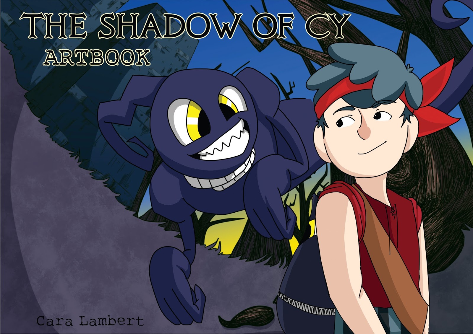
I quite liked the subtle movement in my ending credits. I wanted the ending credits to be simple yet effective, so with the slight movement of the clouds and the grass, I felt that this worked well with the fading in and out text. I kept the theme of the font through out the credits and into my Art Book and DVD cover/booklet, I really liked how these elements all linked through the font. Additionally I purposely made the environment change to day in comparison to the rest of the animation, so that it made it seem as if it continued to the next day, or just a scene change. I really liked the day change as it made the composition stand out nicely to the audience.

I really enjoyed storyboarding this animation, with the reference from Perry Flowers for the main jump scene, it was fun to think of the direction of the camera and how I could emphasise this further with a power angle and/or awareness of space. I had intended for my animation to be storyboard driven. I was so fascinated with fact that I could do this for this project that I eagerly began to storyboard the animation, and forgot that I would have to create a script anyway to send to my voice actor. If it was not for the fact that I knew I would have a few drafts of the storyboard, I would have sent him just the storyboard. Making a script was challenging but it was definitely needed in my animation process.

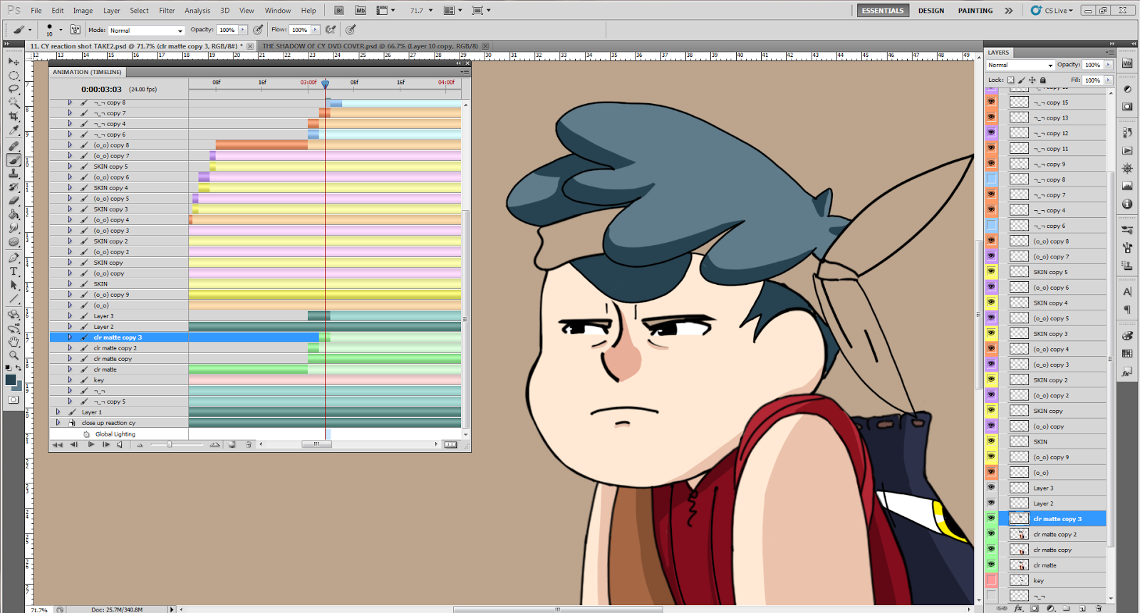
Making this animation by myself has given me insight into the other skills that I have across the animation discipline, not just storyboarding and character design. I loved creating the rough animation, it was nice just to draw what I thought would work at first and then develop it further with reference before adding the clean lineart and secondary animation. I loved adding the subtle movement as the main action occurs and the colour, as well as the addition of backgrounds. I feel like this is something that I can continue in PPP3 and discuss further with animation studios. I have really enjoyed this project throughout all of the production stages.

Extended Animating and Editing: Using After Effects and Photoshop

Predominantly, I used Photoshop to create the main part of the animations, and creating the lip sync in after effects.

Photoshop Notes:

+ It was easy to animate with colour coding, working with layers and timeline rather than video layers which would have been more time consuming. I find it easier working with separate layers, rather than a video layer, as I can easily go back and change that frame, as well as use the previous frame as reference by lowering the opacity. I found that the onion skin tool doesn't work as successfully in comparison to lowering the opacity of the previous layer.

+  Due to the file size and amount of ram, Photoshop couldn't cope with the amount of data to be able to preview the animation or export to a Quicktime file. In order to solve this problem I had to render all the animation out into a jpeg sequence, this wasn't as time consuming as I originally thought as it took about the same time, if not faster at points, to render the sequence.

+ The file size grew dramatically as soon as I started to add colour, and in order to ensure that the quality remained, I had to use a high resolution, 300 dpi. The file size was far too big, the render time was taking far too long, which made photoshop crash quite a few times. Therefore in order to solve the problem, I had to compromise to a lower resolution, 170 or 150 dpi. The quality was still there as long as I didn't pan the camera into the animation.

After Effects Notes:

+ I was able to import all of the photoshop layers into the compositions and edit the timing of the animation further. This really saved time on animating, as in order to ensure that the file in photoshop worked efficiently I had to make the animation 10 seconds. In After Effects I was able to change the duration and duplicate/alter the layers if needed. Furthermore After Effects was fantastic for creating the lip sync to the audio. I was able to ram preview the composition with the audio, making it easier to time the lip sync with the phonemes. 

+ The transform keys were extremely useful for subtle positioning movements. I mainly used these key frames in the ending title sequence to fade in the text and logos. These helped with the movement of the clouds in the background as well. I was going to offset the clouds so that they would loop, however I realised that the clouds moved too fast so the position key frame was all that was needed for the movement. 

+ The main problem I had with After Effects was that it wouldn't render the audio in the preview, at times, it would attempt and then cut the audio abruptly through the preview. I found that this was due to both the ram and After Effects crashing. The only solution I had was to restart my computer in which the software and preview worked fine. Additionally, sometimes when importing the audio After Effects stretched it slightly so when I exported the animation to premiere to match with the audio after I had lip synced the scene, it wouldn't sync due to timing being different. I found no real solution apart from double checking the speed of the audio file before I began to lip sync. 


Photoshop workspace

After Effects workspace

Extended Editing: Using Premiere

Notes -

+ To compose the video with the voice files and score, I used Premiere to edit these elements together. Premiere was easy to use with being able to adjust the audio levels and to key frame an ease in and out of both the audio and visual.

+ Using the razor tool, I was able to easily cut out parts from both the video and audio file and fits these elements back together. I worked on top of the animatic, adding clean and rough animation as well as voice files over the top as the animation progressed. This way the audience could see a mix between the clean animation and the animatic, but still understand the storytelling.

+ Personally I found that working with both After Effects and Premiere was easier than only working in After Effects. I find it easier to compose the animation with lip sync and backgrounds in after effects to which I then import into Premiere to edit further. However to make the ending title sequence, I decided not to make this in Premiere as there are not that many options for animating text in comparison to After Effects. Even though there are the capabilities to achieve this in Premiere, using After Effects allowed me to add additional animation when needed with ease.


Premiere Workspace

Thursday 5 May 2016

Extended Practice: Completed Artbook

For my finished Art Book, I made quite a few changes and additions to both the content and the layout in comparison to the previous version.

I included sketches from the early stages of the project with contextual text describing the thoughts behind the shapes and expressions used in the characters which lead to my final character turnarounds and phoneme sheets  - adding contextual text, explaining the process and any struggles, inspirations.

For the background section I used the completed backgrounds used in the animation. They were mainly enclosure backgrounds due to the completed animation being near the end of the animation however I quite liked the environments that I had made so far. Purposely using purple tints on the enclosure environments not only helped to tie in the eerieness of the entrance of Dusk but helped to blend and standout both characters from the background. Subsequently adding so much detail to the background, the intricate line shading on the trees, helped to make the characters stand out even more to the spectator. My favourite background is the low angle enclosure design used in the 'Enter the Shadow' scene, I loved drawing it. It was alot of fun drawing in such a different perspective and I was able to use a bit of the 'impossible lens' to further emphasise the angle. The impossible lens is something I vaguely researched in my COP3 Project, but this camera shot is something that only animation can succeed with, giving the discipline an advantage that no other medium can even try to attempt. Joanna Quinn, animator and director, is famous for her use of the 'impossible lens', making the perspective warp in order to tell an interesting visual narrative.

The addition of the script before the storyboards worked quite well; it was nice comparing the script to the storyboard. I kept the layout and appearance the same as the premise page at the beginning of the book. I wanted to keep this as a good theme throughout the book.

For my finalized storyboards, I used my own storyboard layouts that I had created during the COP3 module. I added my own logo, Cy's Head, at the top of each page which tied in the panels and heading text nicely. On these storyboards I added the notes for each scene as well as drawing the camera and action notes on each panel. Adding these notes helps both the reader and the animator understand what is happening in each scene, with both the direction of the camera and the main action. I am really proud of the finished boards, after redrawing them a few times, it is nice seeing the final sketches. Even though the storyboards are not as completed, in an aesthetic approach, in comparison to the storyboards I created for COP3, I really liked how the action could be seen with just the image alone. I want to work on this storyboards after the deadline. I am curious to see how much I change the shot, dramatically, to tell the same story, and to see if my target audience would still be able to understand the narrative.

I added a blank black page at before the back cover so that the placement of the pages worked successfully for the booklet. With feedback from a fellow student, Rebecca Wong, I added a silhouette of the main characters head in the bottom center of the page. I really liked this addition, it was simple, working with the rest of my layout and the use of the black page worked with the back cover due to the dark colours used in the composition.

I am really pleased with my final Art Book. I love how simple and clean it looks as well as the amount of images that I've added to each page, making feel complete. I want to keep adding to this Art Book after the deadline and print it in hard back for the exhibit. My tutor mentioned a website, Cafe Press, which printed spiral bound journals The prices are quite reasonable however I want this to be a hardback book or at least fabric bound rather than spiral bound. I feel like it would look more professional and it would be amazing to be able to keep something like this after university.


Extended Practice: Art Book progress so far

For the cover of my Art Book, I used the same elements from both the DVD cover and DVD booklet so that they all linked. I did however change the background to the low angle perspective shot used in the "Enter the Shadow" scene. This background worked well as, the center of the image, the yellow part of the sky, made Dusk and subsequently Cy, stand out the audience; with the text on the page being the second element that you see when you look at the page. I also quite liked the look of this background on the cover as the shading created a nice oval like vignette to the composition.

I slightly altered the structure of the pages compared to the last version, mainly the length of the lines and the use of fonts. I used the same font as the front cover, but changed the colour depending on the subject of the page, with an added black stroke to make the title of the page stand out more to the spectator. I used the same font for the title of the animation, with the addition of a different font, a type writer inspired serif, for the second font. I wanted another font to use as the Art Book would include contextual text for some of the pages, and for the aesthetic appeal, having two fonts can help the style of the pages layout. This worked quite successfully in the note section of the pages, as I used both of the fonts, the main font, 'Knights Quest' being a quote, and the Typewriter esk font being the main body.

I am really happy with the progress so far, I still need to refine the structure for the background and storyboard pages, but I am pleased with the character pages. I like the layout and the addition of text, which brings more insight into the project.


Extended Production: Rough and Clean Animation "Soooo you a geeeenie or something?"

For this scene I wanted to make the frame more interesting with the shot, adding more movement to both of the characters amongst the dialogue. As this scene used the same over the shoulder shot as a previous scene, I didn't want Dusks movement to be too complicated. It needed to be simple so that it didn't take the attention away from Cy's dialogue. I made Dusk hover in the same position to work with his movement in other scenes in the animation. In order to make the main action work more smoothly I added extra movement to his head and body. This worked successfully with the composition and Cy's movement.

For Cy's movement I added a subtle head tilt in which I timed with the dialogue "or something". I really liked this timing as it emphasised the movement and helped the following scene work more smoothly with both the audio and cut to the full close up of Dusk as he reacts to Cy's comment. I added extra secondary movement to his hair and parts of his clothing to add more emphasis to the scene. Cy's lip sync was quite successful. I matched the lip sync with the main mouth that Cy has for the animation, which made the lip sync seem more fluid and smooth. I quite liked how the ending mouth connected so well with changing back to the main mouth.

For the background, I wanted to make the scene more dramatic with the shadow so I added longer shadows which worked with the positioning of the lighting in the scene and well with other backgrounds that have been made so far for this environment.


Extended Production: Rough and Clean Animation - Part 2

These animations didn't really require rough animation to make as they were pretty straight forward with the movement and only needed to duplicate frames from the clean lines.

For the "Enter the Shadow" scene I changed the original shot from the storyboard to a more dramatic angle. Changing the shot to a low tilted angle worked successfully in comparison to the original framing. The composition of the frame took advantage of the primary planes, the foreground being Cy, the middle ground being Dusk and the background giving the piece more depth through the positioning the trees. I wanted to make the spectator part of the scene with the over the shoulder shot, giving a bigger depth of the awareness of space for both the audience and the characters. 

I only needed three frames for Cy's movement, the secondary movement needed to be quite quick and end abruptly with Dusk's movement. Dusk's movement was only a very simple morph, from a blob to him stretching before cutting to the next scene. I did struggle with the yawn movements, as it was difficult with the inbetweens of the yawn mouth movements. I managed to solve this problem by deleting inbetweens, my main cause for the yawn movement from looking jagged was the amount of frames I had drawn.

I was quite happy with the colouring of the scene and the perspective of the background. I felt that it worked well with the tilted camera angle, which worked with the main action of the animation. 


For the next test "What do you mean being stuck with me?", I changed the shot from the original storyboarded version. With the previous scene using a low angle tilted shot, I wanted to change this scene to a full close up to give more variation to the shots. The original scene was a low angle shot, with the lip sync, so I decided to dramatically change the shot to a full close up to work more smoothly with the previous scene. 

This scene depended more on the lip sync rather than the action of the characters. To make the scene more interesting I tilted Cy's head, with secondary animation to make the movement smoother; this only required me moving his head, which I used the transformation tool to rotate the head in the correct position. Using After Effects to create the lip sync made the process easier. I kept the main mouth on the animation as the rest mouth, which worked successfully with the atmosphere and tone of voice. I hid the mouth by using a mask and placing the mouths on top of this layer. 

I wanted to make this full close up shot quite detailed with the shading on Cy, so I added a slight 'Rembrandt lighting' with the 3/4 pose. I felt that this worked well as it aided the aesthetic. Additionally I blurred Dusk in the foreground so that Cy would stand out to the spectator. 

Extended Production: Clean Animation "When you dropped the spyglass"

Before continuing to animate the turn, I wanted to test the colour and appearance of the characters against the background to ensure that the hues worked well together. I really liked the outcome so far, the detailed trees against the block colours of the characters worked really successfully. I personally thought that I would have to revise the backgrounds with the amount of detail but with the addition of peer review, the background with the animation worked well. My only problem was the colour of the sky behind them. It made Dusk blend into the background. I solved this problem by changing the colour of the sky to a gradient of a dark blue to bright yellow. With the contrast of the complementary colours, yellow and purple, Dusk stood out to the spectator well.

Once I had obtained the latest sound files from James, he changed parts of the dialogue which made Dusk sound more menacing, which I personally felt worked nicely with the character. However this meant that I had to animate these small sections in photoshop. I wanted Dusks menacing parts to show him angry, his eyes glowing red and his mouth tearing open. This was alot of fun to animate but it took awhile to get the timing right with the prolonged 'Hunnndredddd Yeeeeearrrsss". After a few tests in After Effects I obtained the correct timing and could continue the lip sync.

I really like the final outcome of this scene, the aesthetic works successfully and the movement, even though subtle works with the secondary animation. I am glad that I added secondary animation to the characters as it helps to emphasise the movement, it makes it more dramatic and smoother. I noticed that some of the colour in the latest render of this completed scene is lost near the end of the video, I will correct this in the original file before adding it to the rest of the animation.


Extended Marketing: DVD Cover and Booklet

With the skills that I had learnt from Food Module, second year extended project, I was able to quickly create a template for the DVD cover. For the DVD cover I wanted the design to incorporate both the main characters, background, and screenshots from the animation.

For the design of the front cover, I used a screenshot from one of the animation sequences. I really liked the pose as it was strong with both the appearance and the line of action. It took me awhile to decide on a font for the design. I knew that the font had to be serif to match the style of the animation. If I used a san-serif font, it would be too soft and wouldn't work as successfully. I finally decided on a free front "Knights Quest" which worked beautifully with the composition; the pointed serif works with both the theme and aesthetic animation.

The blurb needed to be short and sweet, so I limited myself to as little words as possible. Once I had wrote the blurb, I immediately realised that the text needed something to make it stand out from the dark background. I decided to draw ripped parchment for the the text to rest upon. This worked successfully as it linked well to the main alley way background.

I wanted the DVD booklet to be a condensed version of the Art Book with added screenshots from the animation. In addition I added examples of backgrounds and storyboards, alongside the character designs and premise of the animation, which I used for the DVD blurb. With the booklet being landscape it made the process difficult with the measurements and preparing the file for printing. I made the booklet slightly more bigger than A6, which worked when I printed out a prototype.


Tuesday 3 May 2016

Extended Production: Rough and Clean Animation - Part 1

For Cy's reaction to Dusk's comment "A HUUUMANNN" I wanted to add movement to his posture, with the addition of secondary movement of his hair and clothing. I wanted to focus on his facial features as well purely for how much I love to emphasise this aspect in all of my work. For this slight movement, I wanted to show Cy move his head down in a sulk, I needed to plan this subtle movement out in rough animation before I could go straight into the clean animation. I discovered that the main animation only needed 3 frames, I originally had 7 frames but it ran smoother with 3 frames. I thought that the movement would need more inbetweens however I liked the movement as it was, I wanted an abrupt end to the movement to work with the mood change with the character.

Adding secondary movement to the animation is my favourite part of animating, this small movements make the character feel more alive and it helps to make the main movement stand out more to the spectator. I added subtle movement to Cy's hair and clothing, as well as adding blinking animation so that he didn't look as if he was just staring into the distance. I am really happy with the end result, the lip sync was quite easy with the aid of the phoneme library that I made before the production stage of the project.


Extended Production: Rough Animation "When you dropped the spyglass"

I began animating one of the major dialogue scenes, this was the most complex with the amount of movement and lip sync that was needed in the scene. Using photoshop to animate with, I began by resizing the composition of the frame, changing it from the original storyboarded version. I found that the storyboarded version was quite flat with the depth and space in the frame. I wanted to change this and add extra movement to the scene as the dialogue would be at least 12 seconds and I wanted to make this amount of time more interesting than the shadow just hovering next to Cy.

I decided to make Dusk move around Cy, with Cy following his movements. I wanted to make Dusks movements more interesting with wisps and smoke like pieces fragmenting from him as he moves from one position to another. I wasn't sure how to start the animation at first, so I went back to my research and looked at my visual moodboard on pinterest. After being inspired, I was motivated to begin the process. I started with straight lines coming from the shadow but I immediately knew that this wasn't going to work with both the shapes used in Dusks body and the depth that I wanted to create in the animation. After gaining feedback from a fellow student, Alex, she suggested starting with three blobs coming from Dusk's body. I quite liked this idea and I adapted it to swirling around Dusk's body before beginning to break off from as he moves.

I really liked my first test of this movement it worked really nicely and faded out smoothly, I knew that I would later have to change the colour of the wisps to work with the colour scheme of the characters. However I felt that the position that Dusk moves too close which didn't give that illusion of depth in the frame. I decided to move this position further behind Cy. This worked more successfully then I had anticipated as I added more movement to Cy's animation and with both of them moving, it felt more completed for the viewer to watch; more visually appealing.

I then made Dusk move further behind Cy, so that he would end up on the left side of the frame. This worked successfully, as I delayed Cy's reaction to this movement and had him move a second after. Adding this will allow me to add more secondary animation to the piece. I really liked it and after gaining feedback from my peers I knew that I needed to extend the time before he moves to the final position so that the lip sync will work with Dusks movement.


Extended Practice: Final Crit

For my Final Crit Presentation, I merged my animatic with the rough and clean animation, voice and music. I wanted to show the completed voice acting and music alongside the visuals. I really liked how the animation/animatic is progressing so far. The only thing I need to edit with the audio files is that James's voice acting for Cy is slightly too high pitched to work with the shadow; feedback during the crit noted that both the voices sometimes merged into one so that they couldn't tell who was talking at some points of the dialogue.

Feedback and action plan:

+ The feedback at the presentation was extremely positive. I just need to complete as much of the ending part of the animation, with the most dialogue. I am purposely animating the scenes with the most dialogue to show how well I can animate both the action and the lip sync.

+ With regards to my art book progress, I will be adding my script and rough premise. I think that this would work well, with the premise at the beginning of the book and the script at the end.

+ Complete the camera and action notes on the storyboards.

+ Complete DVD cover and booklet.

Knowing how much I need to complete is daunting however I will continue to work on the animation after the deadline as I would love to submit this to festivals and competitions.


Extended Practice; R&D Presentation

The R&D presentation was really helpful in both feedback and seeing the progress that I had made throughout the module so far. I really enjoyed making this presentation, it was nice summarising the progress that I had made before going onto the research and development that I had undertaken so far.
Feedback on the character designs were really positive. For Dusk, the shadow ghost, the only feedback was changing either the colour of his eyes or his collar when hes angry. I really liked this idea, I prefer his eyes changing colour as I think it would work more successfully in comparison to the collar. The other piece of feedback was the design of the Thug, the only addition being that he needed to be fatter to go with the persona that I had given the Thug. I quite liked the idea of the Thug being fatter, so I would like to incorporate this into the design sheets.

With my animatic, I was able to add the music, as Daniel had finished the recent version just in time for the presentation. It was lovely hearing the music with the animatic, tied the story together and it worked really well with the timings of Cy jumping over the kart and when the shadow first appears in the animation. Feedback was extremely positive, with the only negative being that the music needs to be slower at the beginning of the animation.

Example of R&D Presentation

Example of R&D Presentation

Example of R&D Presentation

Monday 2 May 2016

Extended Production: Rough Animation Enclosure Scene

Notes

Gurgle! Scene

+ In this scene the main movement is the shadow, with subtle movement from Cy as he leans in closer to see what is happening. I found it quite difficult visualising how I wanted the shadow to move, whether I wanted the shadow to attack the whole frame and engulf it or have it move rapidly for a second, where Cy would move in closer to see what happened before cutting to the next scene of Dusks introduction.

+ I first tried the shadow disbanding outwards and eating most of the frame but I really didn't like the effect, it was too much, I wanted it to be more rapid and smaller. I tried another experiment with making the animation more rapid and it worked a lot more successfully as it aided the timing of Cy's movements as well. For the rapid movement it was about 4 key frames looped to get that jaggedness to the movement and abrupt stop.


Dusk's Yawn

+ For this close medium shot, I wanted to show Dusk continuing to stretch and yawn wider to help emphasise the timing of the score and voice acting. This animation was quite simple, so it didn't take me long to make this quick animation, however it took me abit longer to ensure that the yawn stretch was smooth and didn't jump. I had to delete a few frames as it started to seem jagged with the amount of frames I had added. 


Spyglass Smash

+ For this animation I found it quite difficult with what movement I wanted in the scene. I wanted to add Cy's feet turning abruptly as he drops the spyglass as if he has jumped back in shock. I attempted this with one of the feet but I wasn't sure, so I went straight to animating the smash of the spyglass to see what it would look like with the extra movement in the background, whether it would distract the audience from the main action in the scene. 

I really disliked the drop of the spyglass, the fall was too linear, which I had animated with the position tool rather than redrawing the spyglass again as it drops. In order to fix this I need to move both ends of the spyglass and make the thud of the spyglass more dramatic. I want to animate this scene from scratch as I really didn't like any of the animation. 


Extended Production: Rough Animation Market Scene Part 4

Notes

Market Scene 8 - Kart crash

+ For this scene I wanted to show the aftermath of the crash with movements from the apples and wheels. The wheels would be animated in After Effects for the ease of the transform key frames. The movement of the apples and Merchant required more thought so they would have to be animated on Photoshop.

+  I wanted the scene to begin with a full medium shot of the Thug buried in the Kart's contents, the cause of the crash, before panning up into a long shot revealing the Merchant. I quickly animated this camera movement in Photoshop, which worked quite well however in the cleaner version of the animation, I want to animate the camera in After Effects to ensure that the movement and timing is smooth.

+ I found it quite easy to animate the Merchant as the movement was straight forward, through how he falls to his knees and is sad about his kart being ruined. I wanted to exaggerate this movement so I made the Merchant lean down more to the floor as he speaks. Using this body language works with the tone of the dialogue, adding to the atmosphere of the scene. 


Market Scene 9 - Run into the alleyway

+ The next scene cuts to a long shot of the crash with Cy running in the foreground. I wanted the actions to connect, so the audience could see what happened to both the Thug and Cy. I felt that making the background slightly blurred would make Cy's action run smoother and stand out more to the spectator. 

+ For this running sequence, I used the knowledge I had gained from the previous run cycles and turning animation, and attempted to animate this scene. This shot was surprisingly easy compared to my initial thoughts, the only difficulty was making the arm movements gain momentum near the end of the action. I felt that I succeeded with this timing quite well, I was really pleased with what I had accomplished. The only addition I would like to add to the sequence is to make Cy run on scene from the right hand side of the frame. I felt that this would be more successful as it would frame the crash in the background. 


Extended Production: Rough Animation Market Scene Part 3

Notes

Market Scene 5 - The Jump

+ For this sequence in the animation, I used the reference that Perry created for the scene, playing the frames alongside my animation document, so that I could get an idea for both proportion and movement. To make the animation run smoother I deleted a few frames, which made it work with the previous animation scenes that I had completed so far. I felt that the run towards the camera held a rotoscoped approach to the movement however I know that this will be easily fixed once the clean lineart is applied to the key frames. Having the secondary animation incorporated into the clean lines will make the whole scene seem smoother. I also want to make the bag swing more to the side and have a delayed movement, moving to the other side after the main character has moved his arms. I believe that this will make the action more dramatic and hold a nicer charm to the animation. 

+ The main jump of the animation is framed within a profile long shot that shows all of the character as he propels himself over the kart. At first this part of the sequence was quite daunting as drawing the profile of the character is difficult, I find that I loose that sense of depth with my profile drawings, so I would need to add more shading and possibly turn his head slightly before he jumps to bring back this approach. I really liked the jump as it worked successfully, there were only a few frames that needed altering again with the proportions of the limbs and the size of the back, the head needed to be seen more in the frames; using the reference that Perry gave me was difficult at times with the top that he was wearing, as it covered parts of the limbs and neck. I had to guess with a lot of the proportions. This can easily be fixed with the addition of the clean lines and inclusion of colour.

+ For the landing of the animation, I wanted the movement to be quite short, with the camera panning and the background moving as well. These elements, the camera and background needed to be animated in After Effects so I could use the offset effect to repeat the background correctly with the direction of the camera. I felt that the landing was too fast, I needed to make the initial frame, where the feet hit the floor to last longer, adding more anticipation and squash and stretch to the animation. Adding these to the movement will help make the action feel more dramatic and emphasised. 


Extended Production: Rough Animation Alley Scene

Notes

+ The turning for this sequence was quite difficult at first as I had to determine where the alley wall would end, so that the movement would work with the turn. I decided to extend Cy's walk before turning, just incase the background needed a longer wall to work with the rest of the environment already seen in the animation. I felt that the walk into the scene was quite stiff, the arms don't bend enough so I need to correct this in the clean lineart, it need a follow through of action with the elbow in comparison to the shoulder.

+ The clean animation for the beginning walk, worked well however the only problem was the length of the arms. The length of the arms seemed to grow shorter and then longer again which I need to fix for the next test. I also wanted to make the hands move more after the position of the elbow to help emphasis the movement.

+ The actual turn was relatively easily, I did find it difficult with proportions again but the main action was quite easy to roughly animate. With the clean lineart I really liked the turn. It worked well with Cy's hair and facial features which made the turn smoother. I purposely added Cy leaning forward in excitement to give that awareness of space off screen to the shot. This will help the transition to the next scene run smoothly with the next frame showing what Cy has seen; I wanted to add more anticipation for the audience with what Cy has walked into.


Running into Alley

+ This scene was the hardest animation that I had done so far. I really love the above shot angle but trying to get the run sequence to work with the angle was very frustrating. I gained inspiration from my pinterest mood boards and The Animators Survival Kit, which helped a lot with the considerations of the contact and pass of the legs. It took me awhile to get the first few frames to work properly due to both the perspective and proportions. Once I had succeed with the main movement I noted that a few frames were too big for the environment so I would have to scale the running as it moved down out of the frame. I quickly achieved this in photoshop with the key position frames however I would rather use After Effects with the final clean and coloured animation to ensure that both the camera movement and scale of the run were correct. 


Extended Production: Rough Animation Market Scene Part 2

Notes:

Market Scene 5 Kart Persp2 and Persp1

+ Using inspiration from The Animators Survival Kit really aided me with this walk cycle. I wanted the Merchant to have wider strides than Cy's run cycle at the beginning of the animation, with bouncier steps to work with the clothing and shoes that the character design would obtain to work with the rest of the characters; big shoes, loose clothing for secondary animation. The first text had small strides with the movement being too fast, I needed to add more frames and double them to make the movement slower and smoother.

+ After applying these edits I was happy with the speed and size of stride for the walk however I had neglected to add the kart with the cycle, so the cycle so far may no work with the kart. I quickly added an extreme rough kart movement, so that I could animate the arms in correspondence to the height of the kart, with the merchant pushing the kart. I wanted the kart to be animated in After Effects with the ease of the transform keys which would make it easier to rotate the wheels and the main body of the kart. I had experience from animating karts, from the responsive module in second year with the proper corn brief. I found animating in After Effects saved so much time as it meant that I didn't have to edit the original video layer animation that Alex, my collaboration partner for the brief, I could easily animate over the top, and blending the movement with a gradient or blending modes.

+ The rough kart was quite wobbly with the lack of consideration of the lines, I only wanted to focus on the Merchants movement, however I was quite pleased with the speed and timing of the animation, the only possible problem is how far he moves. I would need to move the whole animation more to the left of the frame, otherwise the movement of the arms and the strides worked successfully with the movement of the kart.


Market Scene 4 Running and Turning

+ This scene was extremely difficult, it took me awhile to get the perspective of Cy's body correct. it was mainly the arms in which I had the most challenges with. I used my self as reference for quite abit of the sequence, especially with the turn of the head, I didn't want the head to turn too much as it would look as if he has dislocated his neck; I wanted the movement to look realistic.

+ After getting the turn correct with the proportions of the arms and back, I started the clean lines. I then hit another problem, the proportion of the hands. In my character designs I purposely made the hands and feet bigger as it worked with my illustrative style and helped to bring a western approach to my work; this helped to make the designs suit my target market, young audience.

+ In order to solve this problem I used my pinterest mood boards as reference and myself as well. I mainly used a small mirror that I keep next to my workspace, to help draw expressions, and took photography; I had to use the transform tool to alter the sizes of the hands at first as I drew the hands too big for the design and had to scale the hands down to work with the turnaround, this way the hands would slightly get bigger as the hands get closer to the camera.  Overall I was really happy with my animation. The scene became smoother with the addition of the hair, clothing and expression movement which I felt worked successfully with the atmosphere and running action. Additionally I changed the framing of the animation in comparison to the original storyboards as I moved the camera to a full medium shot and emphasised Cy's movement more by making him turn more.


Extended Production: Rough Animation Market Scene Part 1

Notes:

Market Scene 1

+ Needed a bouncy run to work with the shape and size of the shoes in Cy's final turnaround design.
I found this quite difficult as I had never done a run cycle before so I used a lot of reference from my pinterest moodboard and inspiration from Richard William's The Animators Survival Kit, which helped considerably with consideration on the contact and pass of the run cycle. I found it easier to draw the run cycle with normal proportions and height, in comparison to Cy's, I would need to scale down the height of the run cycle and extend the legs slightly so that it would work for his character.


Market Scene 2 Thug Stumble

+ I wanted the Thugs entrance to be quite dramatic but funny at the same time. I wanted his belly to bounce as he skids to a holt, skipping as he tries to stop the momentum. I found this difficult at first as the timing was quite fast with the belly wobble, however introducing spaced out frames for the belly wobble in comparison to the main movement will easily solve this problem.

+ Additionally I need to add a delayed movement of the head and torso after the Thug stops moving, in order to emphasise the movement and make it run smoother. As the character designs haven't been completely finalised for this character, I quite like the idea of adding some hair or a patch of hair so that the secondary animation would work well with the movement of the head.


Market Scene 3 Thug GET BACK EREEEE

+ For this animation it was relatively simple with the Thugs movement as he is just angrily shaking his fist, I ended up drawing about 5 frames and looping them which worked quite well. I want to add a bit of secondary animation to his head, possibly a slight tilt of the head to make the arm movement seem less stiff due to the rest of his body not moving.

+ For Cy's movement in the scene, I found it incredibly difficult. It was hard trying to get the proportions of the legs and arms correct with the run being from behind as he runs into the distance. Using The Animators Survival Kit as inspiration I managed to make a smooth back run cycle, however there is one frame where the right leg is slightly longer, so it looks out of place compared to the rest of the frames. I can easily solve this when drawing the clean animation, by redrawing the proportions. In After Effects, I will scale down this run cycle so that it gives the illusion of Cy running further away from the thug.


Wednesday 13 April 2016

Extended Design: Reviewing David's Storyboards

David asked me to quickly look through his storyboards in which he collaborated with Sophie, a third year illustration student. It was fun revising the storyboards, it was nice refining his work further creating something that was visually interesting for the spectator alongside the dialogue. I really enjoyed reviewing and debating about what the shot would look like with Sophie and David, there were so many ideas and it was nice picking out the best ideas and coming to a compromise with the group with what realistically could be animated.

I found that the main problem was the sheer amount of close ups that were in each board - this made quite a few of the scenes feel flat and uneventful with the fact that the audience couldn't see the space or/and even the characters did not have this awareness of space. This could be easily fixed with mixing up the shot with different angles and extreme shots, close and far. Alot of the scenes were the exact same, which one of the scenes it was perfect for the comedy but the rest needed something different to make the narrative more interesting for the audience. An example of this is within the scene where the main characters mother leaves the room by shutting the door, the main character trying to sleep. This shot was kept at a profile view, med shot throughout the sequence. I suggested having a long shot, with the main character in the foreground, rolling over towards the audience, with a long cast shadow of the mother as she closes the door over the main character. This worked really well as it broke up the previous shots. Sophie changed the angle slightly but the overcast shadow became a good way of interpreting the original narrative to enhance the progression of the scene.